Case Study:
Lint Check

Beauty meets functionality.
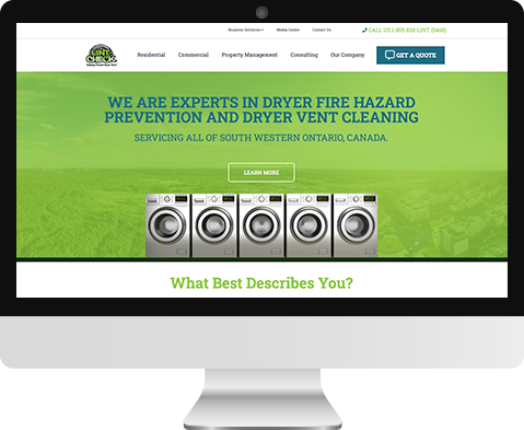
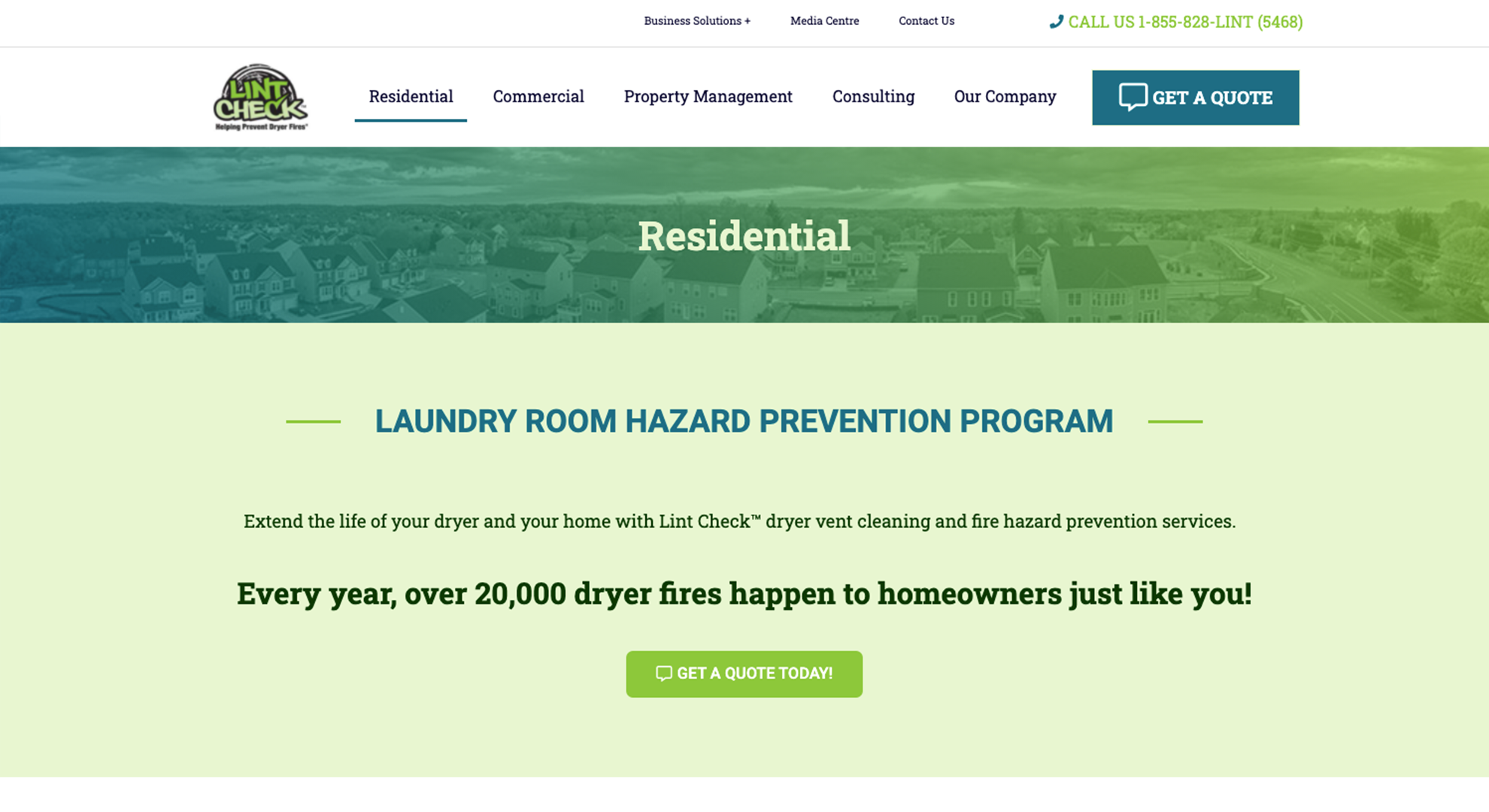
We redesigned their site to have a corporate yet friendly feel. We kept in mind that this website would expand into different areas of services in the future. Most importantly we wanted to speak to different types of customers like homeowners, commercial businesses, to property managers.
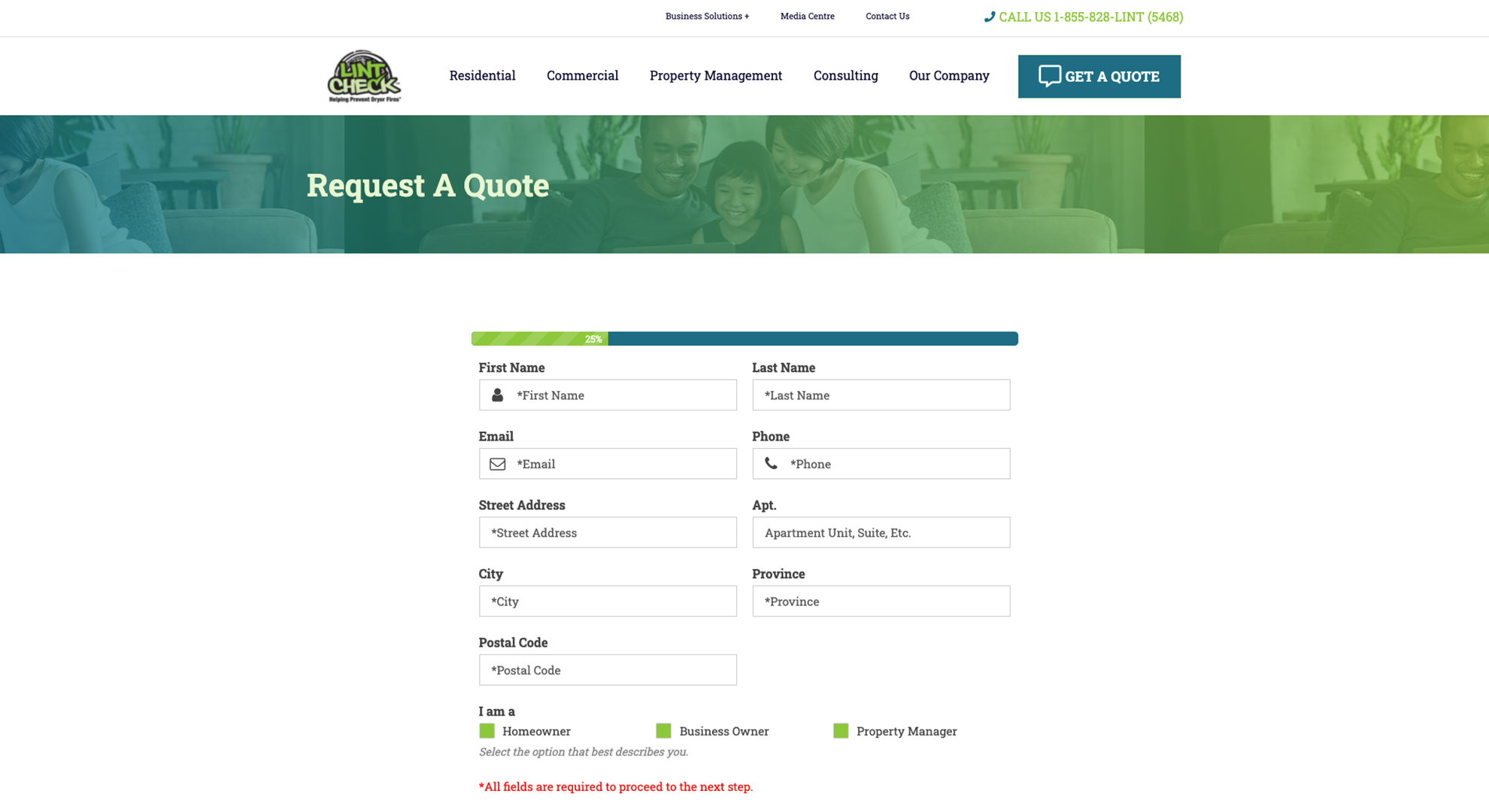
We started with the consultation phase with the client. This included mapping out their existing website by illustrating a flow chart. We first designed the menu to be concise and prioritized the items. Secondly, we wanted to speak to the different personas that visit the site to make it easier to navigate by dedicating an area below the hero section. This direction gives a clear message to each user. And finally, we made sure the quote form was fully functional as this was the backbone of the site. They retrieve many submissions daily and they can’t afford to miss those opportunities.
As we mentioned before, the site can expand to meet the clients needs both functionally and navigation wise.


