Case Study:
180 Wellness Clinic
Ancaster, Ontario

Starting a brand.
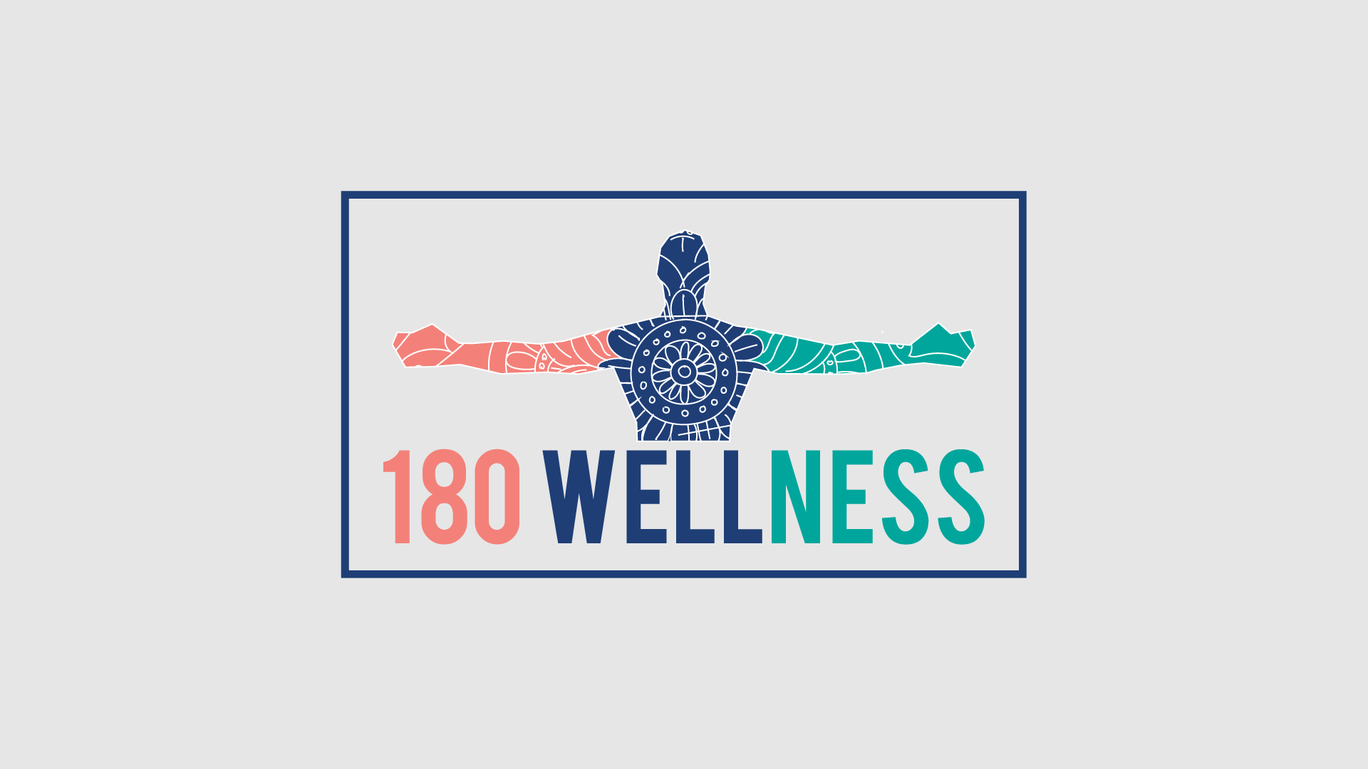
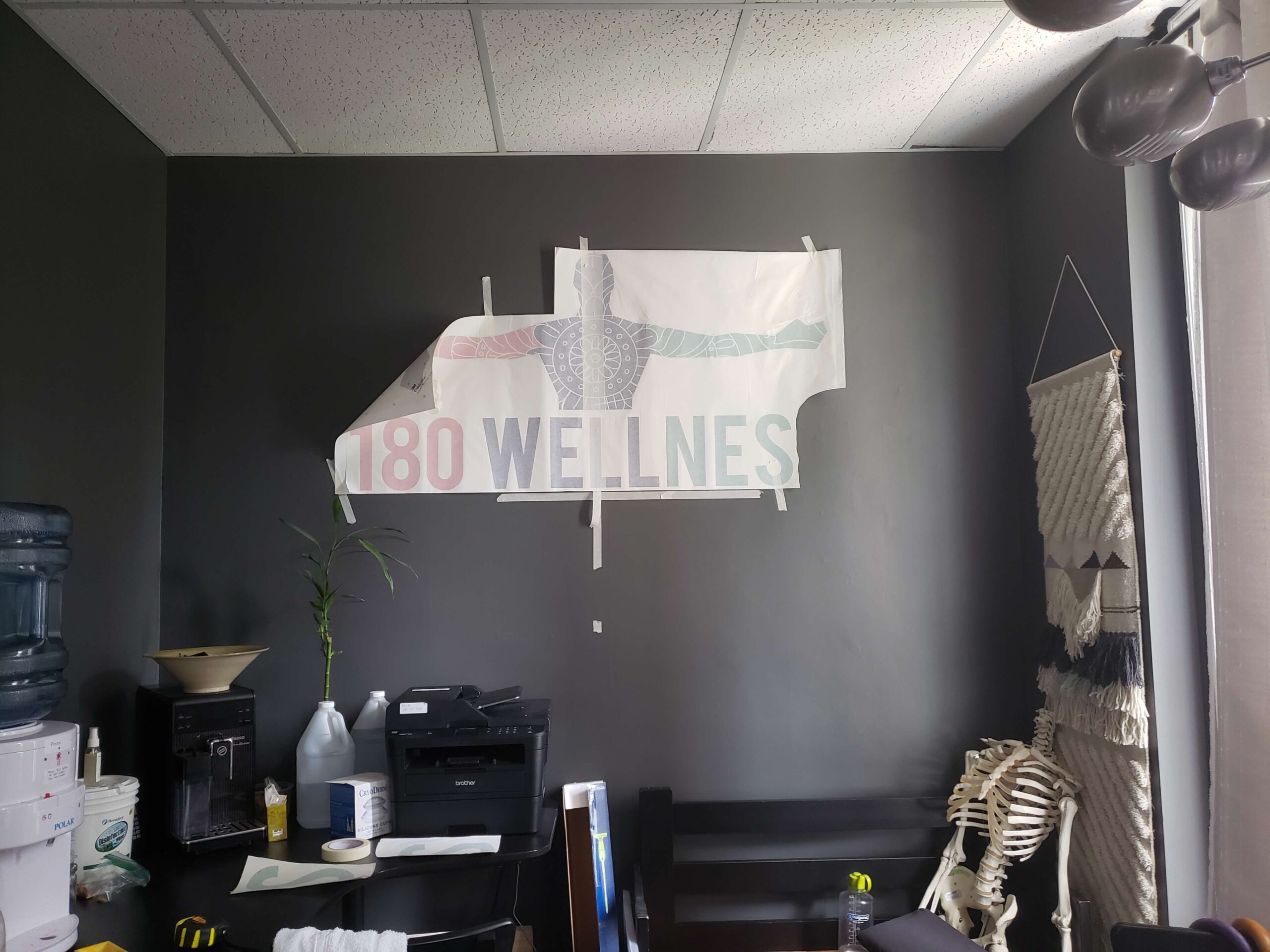
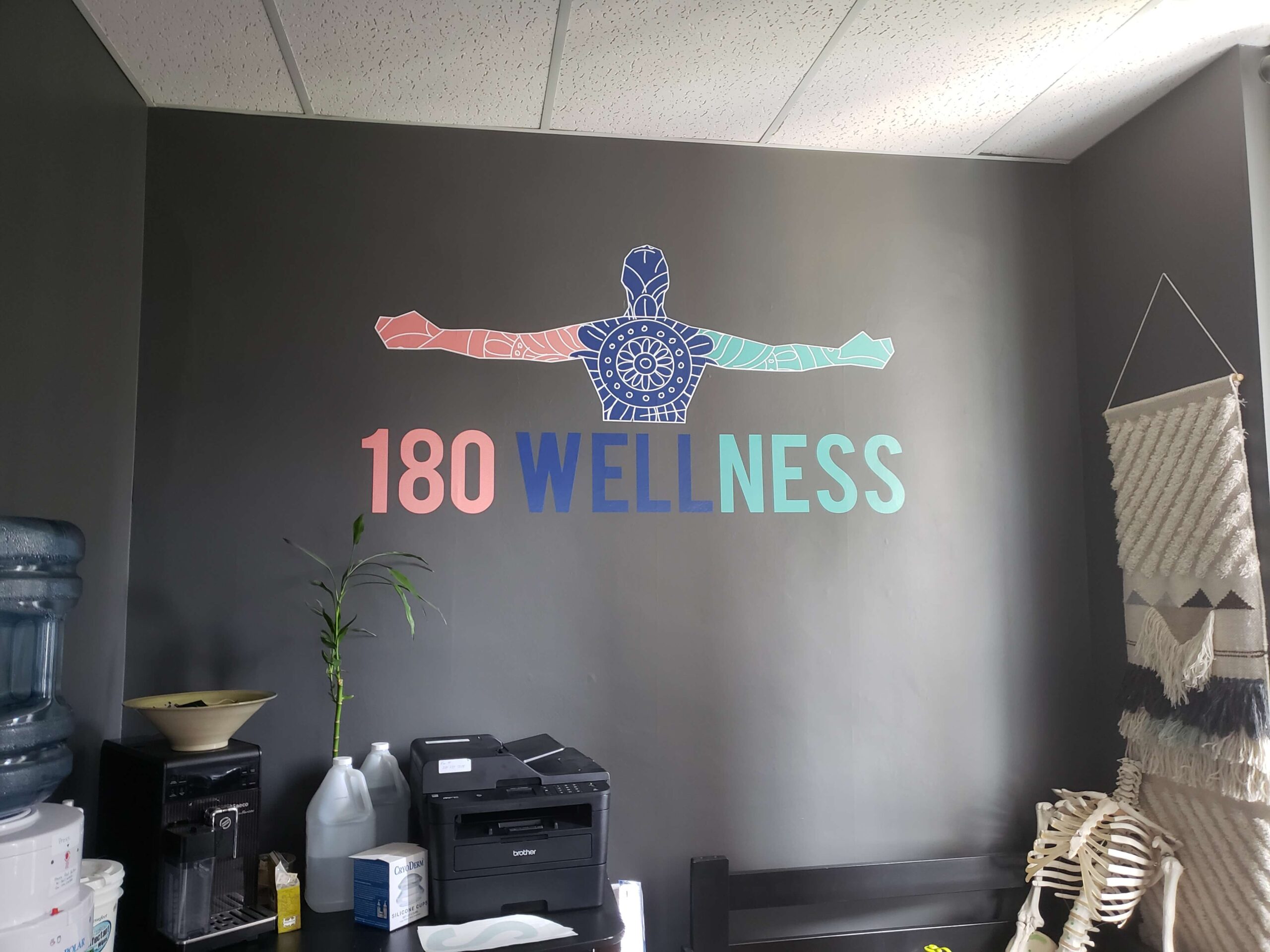
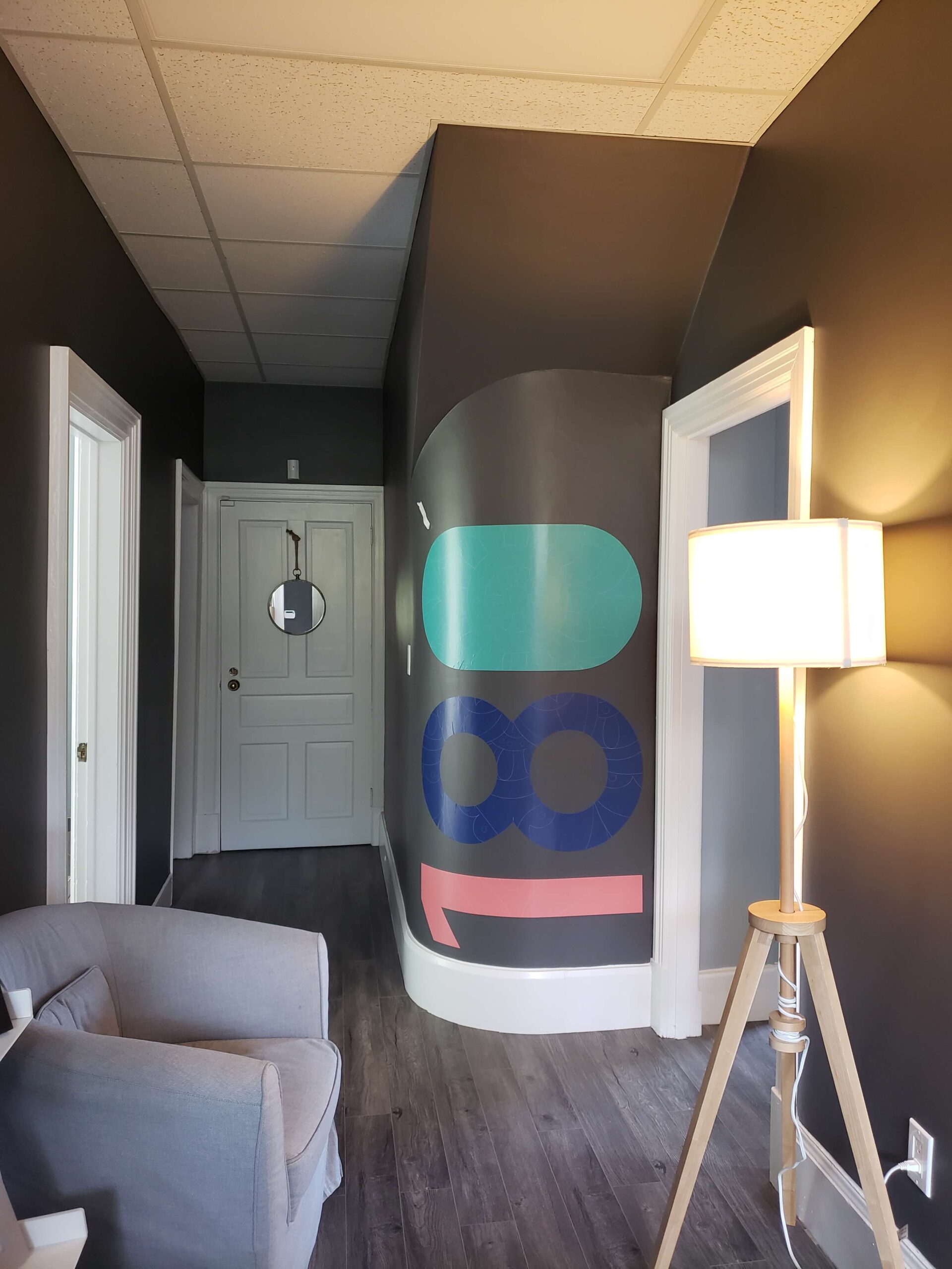
The client approached us with a logo challenge as they were needing something specific in mind. We followed direction and came up with a logo that met their expectations. Furthermore, we presented three colours that personified a balance between masculine and feminine. Once the logo was created, we designed their business cards, website, and printed and installed decals for their office.
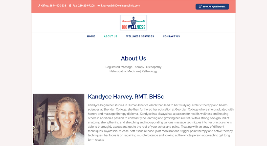
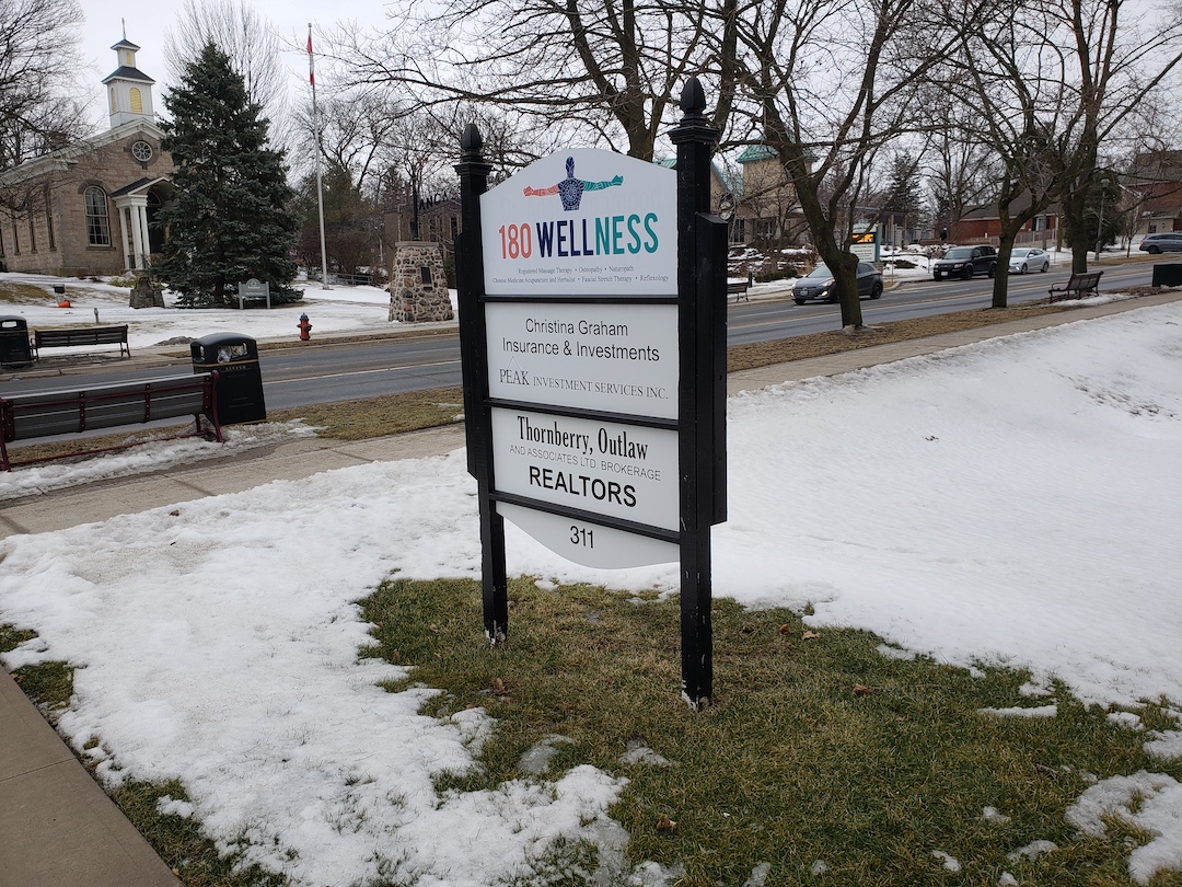
The brand was established and the client had outdoor signage made with the logo. The website included the colours of the logo for consistency. We delivered a high end looking brand on budget and time.
